As time goes on the visuals in games get more and more incredible, from the photo realism of games like Uncharted 4: A Thief's End to the Pixar-like quality of Ratchet & Clank. Every year games get better better and better in this category, thanks both to the advancement of technology as well as the continued emphasis on a beautiful cohesive aesthetic. This year definitely gave us a glimpse into the future.
Here's the list of nominees (and here's a list of all nominees for all categories):
- DOOM (Game Page)
- Final Fantasy XV (Game Page)
- Overwatch (Game Page)
- Ratchet & Clank (Game Page)
- Uncharted 4: A Thief’s End (Game Page)
Reader's Choice - DOOM (Our Review)
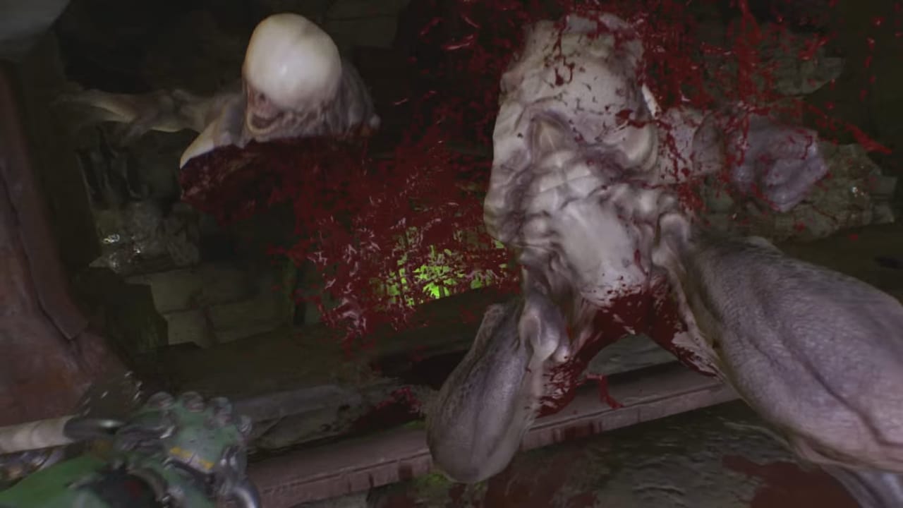
This was probably the most contentious category for voting, with DOOM only coming away with a third of the votes. However, there's no denying that it deserves praise for bringing DOOM to the newest generation in a very satisfying way—there is much blood and viscera to go around.Third Place - Overwatch (Our Review)

By Samantha Ooi
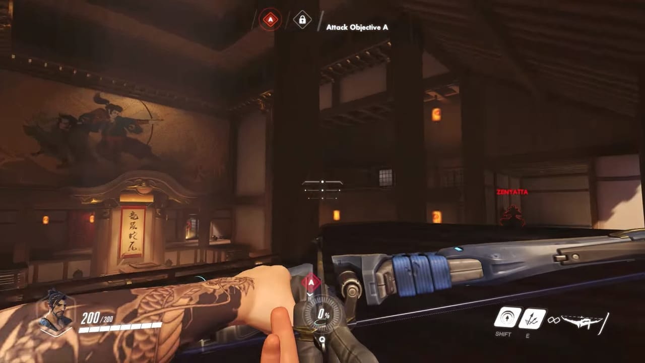
Overwatch is Blizzard’s first new franchise in over 17 years, and it had to make a bold first impression to makes its mark and make itself standout from the rest of Blizzard’s legacy.The design and tone of Overwatch draws from the idea of classic superhero stories. The characters of Overwatch are meant to be superheroes and supervillains, with exaggerated quirks, costumes, and poses. Players are coming into the game with no in-game backstory to tell them who these characters are or what they do. Like the line-up in a league of superheroes or a rogue’s gallery, each of the characters has to stand-out from each other and make their role immediately clear to players.
Why players immediately know Reinhardt is a tank that’s meant to take a lot of damage and hit enemies in melee with his hammer, or that Mercy with her angelic golden wings is a healer, is because the character design uses comicbook style exaggeration and a little stereotyping. The end result is highly iconic characters that set the tone of this new Blizzard universe.
This factors heavily into gameplay as well. Each Overwatch character has a clearly defined and unique silhouette that makes them recognizable from a distance or in the middle of a firefight. The way they are animated also conveys their traits and personality. The lumbering gait of Roadhog or how he roughly reloads his shotgun tells players a different story from the quick and slick movements of Genji. Not only is there characterization, but players recognize characters from their body language as well, giving them visual information that they can process quickly in the middle of the match or in their peripheral vision.
Overwatch was able to draw players into a dynamic and new universe without the luxury of an in-game story mode, and it was able to put that philosophy of boldness into its character design.
Second Place - DOOM (Our Review)

By Alex Santa Maria
When I played DOOM 3 years and years ago, I came to terms with what a “modern” DOOM would look like. I accepted that you couldn’t just transition the crude designs of the 1993 original into the modern age and call it a day, and I even defended the wheelchair design of the new Pinky. However, I was young, and 2016 showed me just how naive I was with the shotgun blast to the face that is DOOM 2016.Walking the tightrope between serious and parody in so many ways, DOOM’s visuals recall back in perfect ways to the classic games with subtle tweaks that make combat more fun. Every enemy that returns is recreated from its original design and then enhanced with modern graphical wizardry, solidifying Cacodemons and Pinkies as iconic gaming foes. Players even have new ways to dispatch these foes, with the highly detailed and gruesome glory kills that allow you to get right up close to the character models and really see all the detailed work that went into bringing these characters to life.
Of course, this doesn’t even go into the environment design, which brings the good parts of DOOM 3 forward. The design of the UAC facility is just as you remember it, and its various interactive screens and hologram systems blend in perfectly with the occultist symbolism that lines ever shelf. Once you dive into hell, you’re treated to a surrealist playground of evil that is both familiar and new, keeping the variety up and the quality high.
Winner - Ratchet & Clank

By Connor Foss
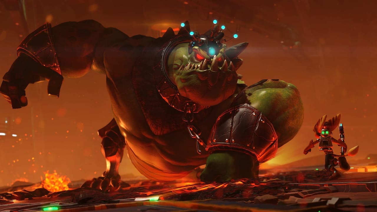
How many of you recall the halcyon days of 2007? Back then, Ratchet & Clank Future: Tools of Destruction was being hailed as a playable Pixar film. Insomniac Games has always been lauded for their ability to make gorgeous games, and all of their previous efforts have culminated in what can only be described as a visual masterpiece.Comparing Ratchet & Clank to a Pixar movie seems silly at this point, as with this game they literally took the in-game assets and made a movie with them. Literally, some of the scenes in the movie are cutscenes taken directly from the game! That should tell you just how incredible the game looks. Ratchet & Clank stunned me, and the only reason I knew I was supposed to move my characters in the beginning was because I had played the original on the PlayStation 2.
This remake is an incredible visual treat. Each character and level lives and breathes detail. To see the difference from the PS3 titles is impressive. Seeing Ratchet & Clank side-by-side with the original is downright astonishing!
Each planet is brimming with eye-popping color. Gaspar is all about the bright lava reds, while planet Novalis feels like a vibrant green set of fields. Rilgar seems like a seedy city and the space station you visit feels sterile and cold. Atmosphere is nailed in Ratchet & Clank due in large part to its fabulous graphics.
One such example is the mission in which you take control of a ship to defend the Galactic Rangers. This truly shows off the prowess of Ratchet & Clank. The city you fight in is dense and packed with detail. The depth of field is deep, letting you take in the bustling city as you duck and swerve through its buildings. Much like the characters, it just feels so alive. They truly put a lot of care into the environments.
On top of this, the characters are made incredibly lively by the pros at Insomniac. Each character is bouncy and animated. You can feel most of their personality just by watching them jump around or gesticulate wildly. Ratchet himself is always moving one way or another, and I can’t help but smile every time he does with his huge face.
The stars of the show, however, are the weapons. Some look pretty basic like the starter blaster, but some do the job great. There’s a certain weapon that you toss out and it spins with a vibrant pink core, and pulses quickly, damaging enemies in the radius around it. The Groovitron also makes a return, distracting enemies with reflective disco ball that spills color everywhere as it turns.
All in all, there’s just a gorgeous, eye-pleasing game here. It’s hard to come up with so many ways to say it, but Ratchet & Clank deserves every single one. Insomniac truly outdid themselves this time and pushed the PlayStation 4 to its limits. I can only imagine what it looks like on the Pro! Suffice it to say, however, that any way you slice it, shoot it or smash it with your wrench, Ratchet & Clank finally does look like a playable Pixar movie.
No, scratch that. Ratchet & Clank looks like a playable Ratchet & Clank movie.
What did we miss? What did we get wrong? What did we get right?
Have a tip, or want to point out something we missed? Leave a Comment or e-mail us at tips@techraptor.net


